Three simple tips to help find errors in your documents
Once your report has the right words in the right order you still need to check it for mistakes. This requires a close-reading of the text and it can be difficult to see mistakes when you are so familiar with the text. Here are three simple ways that can help you spot mistakes.
1️⃣ Change the colour, font and/or size of the text.
If you have used a serif font try changing to a sans-serif or fixed width font. Changing the way your text looks helps you get some distance from the original text.
2️⃣ Use your ears instead of your eyes.
You could do this either by reading the text aloud or using a text-to-speech service to have it read to you by your computer.
3️⃣ See the invisibles.
The default option in Word is not to show the non-printing characters such as spaces, tab characters, page and section breaks and paragraph end-markers. On the Home toolbar there is a button with what looks like a backward P on it (the symbol is called a pilcrow). Click that to toggle the formatting marks on and off.
With invisibles toggled on you will see where there are multiple spaces instead of single spaces and where multiple carriage returns have been used to force a line onto a new page instead of using the page break command and so on.
Four alternatives to boring audit reports
Internal audit reports have not changed much since I wrote my first one in 1987. The technology has changed but not the content or structure. I wrote my first audit reports in the 1980s by hand and they were then copied by a typist before being sent to the client. Modern technology hasn’t done much more than remove the typist from the process.
But they don’t have to be a mass of text with the occasional table.
Internal audit standards don’t say auditors have to write a report; they say auditors have to communicate their findings. Here are some better ways to do that, using more of the power of the computers we have and not just typing out text in Microsoft Word.
📄 Use Notion (or Craft or a similar app). Notion is a web-based app that allows documents to be created from blocks. The most basic block is text but it allows for media, webpages, files, databases, calendars and all sorts of things to be embedded. It also has ‘toggle headings’ where the content can be shown or hidden at the click of disclosure triangle.
Apps like this are great for collaboration so audit team members could all contribute to a report. It also makes it easy for audit managers to review reports before they are issued. Once ready, all that needs to be sent to the client is the URL. They would get an INTERACTIVE document that looks just as great on a smartphone as it does on a computer 0r large screen.
ℹ️ Infographics. One way to shorten audit reports is to replace all that text by images and charts. Probably the best way to implement this approach would be to have templates created for the common outputs that can be quickly completed by audit team members.
📺 Video. This could be an internal auditor talking direct to camera or a recording of a short slide presentation. A lot more information can be conveyed by the auditor without resorting to creating a slide deck of (boring) bullet-points.
🎤 Audio. It’s a video without the pictures. It’s a much smaller file to send. You can make them on your phone.
What’s stopping you from adopting any of these?
Over the last 2 months I have been writing a diary on the PFM Board managed by Mauro Napodano. My diary describes the process of writing my book from a casual conversation about the original idea in 2008 all the way through to writing the third edition that will be published next week.
The final entry includes the opportunity to win a free signed paperback copy of the new edition. Go there to read the diary and enter the draw.
Stop writing finance reports like crime novels
Finance reports are not crime novels so don’t write them as if they are!
Whether writing an email or a 20-page report we tend to think of it needing a beginning, middle and end. This encourages a structure along the lines of:
Here’s a problem ==> This is the cause ==> These are possible solutions ==> Analysis of solutions ==> Recommended solution
The problem with this kind of structure, for busy people at work, is that the important bit is at the end. The reader (your boss or client) has to work through all your analysis to get to the answer. Report-writing is not (or should not be) for you to show off about all the analysis you have done.
You should focus on the needs of the reader and bring the end to the front of the report. Tell the reader the recommendation first and then explain why. This means a structure along the lines of:
Here’s the recommended solution to a problem ==> Explain why this is the recommendation ==> Analysis of possible solutions
One advantage of this structure is the potential for it to be framed more positively. It starts with suggestions for solutions (improvements over the status quo) rather than the negative start of describing a problem, challenge or something that has gone wrong.
Next time you are planning a report see if you can structure it so that the reader gets the conclusion/recommendation without having to read a long mystery story first.
The best email is a short email
I’ve shared before that,
Perfection is achieved, not when there is nothing more to add, but when there is nothing left to take away.
When you write an email keep it as short as you can.
Then…
Before you press send, review it. Remove all the sentences you don’t need. That probably means taking out the opening niceties so that you get to the point straight away. Remove details that aren’t essential.
After deleting unnecessary sentences, remove the unnecessary words from what’s left. Cut out adjectives and adverbs. They’re great in novels to add colour and emotion but not needed in business writing: choose better verbs and nouns instead.
If your email is requesting some action from the receiver make sure that the action is very clear. If the email is for information only, make that clear, too.
Including phrases like ‘For Action’ and ‘For Information’ in the subject line helps the receiver in two ways. When scanning their inbox they can see what emails are about without opening them and when they select your email they know what to expect when they open it.
Now you have an email that is short and focused. It give the receiver only what they need. It’ll be perfection!
Note: The quotation at the top is by Antoine de Saint-Exupery, the guy who wrote The Little Prince.
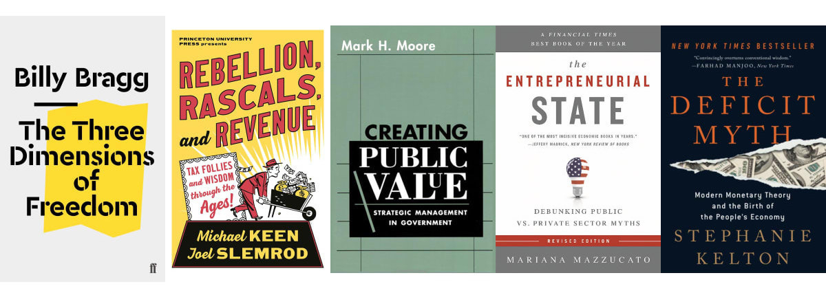
I wrote a list of the five best books about how governments collect and spend taxes. Check it out.
#PFM #publicfinance #tax
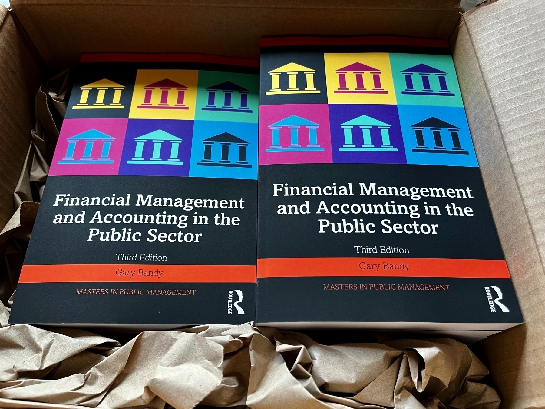
My free copies of the 3rd edition of Financial Management and Accounting in the Public Sector came today.
Three tips to help accountants to write faster
1️⃣ Use keyboard shortcuts
Navigating documents and spreadsheets is quicker using the arrow keys than using a mouse or trackpad. There are shortcuts for most of the popular actions such as copy (Cmd/Ctrl + C), paste (Cmd/Ctrl + V), save (Cmd/Ctrl + S), and open (Cmd/Ctrl + O). In Word the shift key combined with arrow keys highlights text faster than you can drag a mouse.
You can see the shortcuts next to the items in the menus in apps like Word, Excel, and PowerPoint. You could also do a web search for lists of shortcuts
2️⃣ Use text expansion
There are some phrases, sentences and paragraphs you use over and again. This could be contact info like your address or the disclaimer text for a report or the standard text you use in emails when you send the monthly report to your boss (if you don’t always use the same text for something like this, why not?)
Text expansion is a service where you link a short trigger phrase to a longer piece of text so that when you type the trigger phrase it is replaced by the text. For example, when I type ‘socf’ it is replaced by ‘statement of cash flows’ and ‘xdate’ is replaced by today’s date.
You can also use text expansion for auto-correction of words. For example, when I type ‘cipfa’ it will automatically be capitalised to CIPFA.
There are many text expansion apps available and which suits you depends in part on the devices you have and how much you are willing to pay to save time. TextExpander is the one I use. (If you use Apple devices you can do text expansion for free because it is built into the operating systems. Go to the Keyboard section of settings to set it up.)
3️⃣ Use your voice
I am sure you can speak faster than you can type. Smartphones are getting better and better at voice-to-text translation. Now, we can all dictate our writing without having a personal assistant and the artificial intelligence means the translation improves the more you use it.
Next time you have a document or long email to write that is a few paragraphs long try dictating the first draft on your phone. You could save a stack of time and effort.
The new edition of my book, Financial Management and Accounting in the Public Sector, is not due for publication until 14th March but today I got an email saying my (free) author copies are on their way to me. Exciting.
#accounting #pfm #publicsector #author
4 tips for smart writing
These are the rules for smart writing, the Axios way.
-
Rephrase sentences to be shorter and clearer.
-
Reformat paragraphs so what’s key stands out.
-
Remove filler words so readers stay focused.
-
Style your text to be quick and easy to scan.

You don’t have to be very good to be better than your peers
To get a promotion you need to have something that makes you better than the competition.
You might decide that for you that thing will be your technical knowledge. You will know accounting standards inside out or you will be the person everyone turns to when they can’t figure out how to do something with the finance system.
If you can’t, or don’t want to, be the best in your business at the technical stuff, here’s a suggestion for a way to stand out. Be better than everyone else at presentations.
To be honest, the standard of presentations in business (other than in sales teams) is so poor that it won’t be hard to impress everyone.
If you do just one of the following three things you’ll be better than most people. Do all three and you’ll be the person others ask for advice on presentations.
✅ use a pen and paper (not PowerPoint or other slide app) to work out your key message and how best to communicate it
✅ when you create slides use images and as few words as possible to support what you are saying
✅ rehearse (preferably out loud rather than in your head).
That’s it. You can thank me later.
How to format a chart for your reader
Often the best way for numerical information to be communicated in a document or presentation slide is in a table. I’ve written before about the need to declutter tables so that the reader/audience can easily see what is important.
If you decide that you have numerical information that would be best displayed in a chart then the same principle of removing the clutter applies.
Download this handy guide to remind you next time you add a chart to a document or presentation.

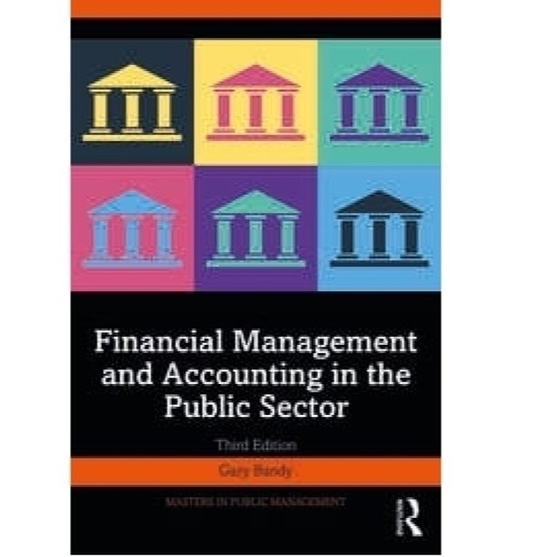
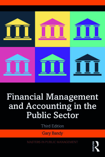
The typesetter has sent the finished files for the 3rd edition of my #book to the printers. This is the cover. It’s published on 14 March but you can pre-order it now.
